July 01, 2024 869 words 3 minutes to read
Welcome to the New Deep Sky Workflows

Summary
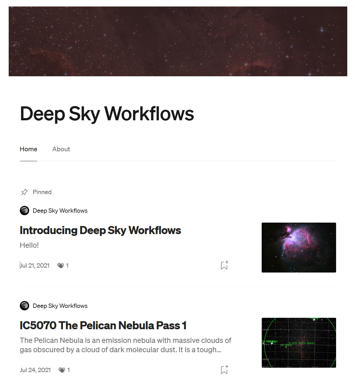
I launched Deep Sky Workflows three years ago this month. I wanted a simple, easy way to share my photographs and thoughts around astrophotography. I used Google Photos to store my images and Medium to author my blog. As I continued to learn more, I quickly decided that simply sharing articles and photos wasn’t enough. I wanted more control. After looking at my options, I decided to go with the Jeykll static website generator. At the time, I wasn’t focused on my brand or design, so I decided to use a template to make the website look more like Medium.

Fast forward several years later and the content has grown exponentially. Unfortuantely, the technology was still very much stuck in the past. There were many issues including poor rendering on mobile devices. Two things happened that prompted me to make some changes. Thinking I was being helpful, I wrote a help page for my gallery because there were so many search options and filters. It was only after I published it that I realized my approach was completely wrong: if a simple gallery is that complicated, the solution isn’t to help the user. The solution is to help the gallery by simplifying it!
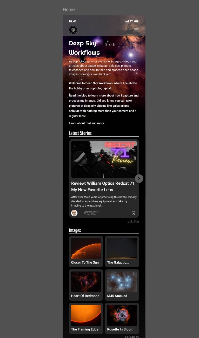
Around the same time, my daughter introduced me to a designer named João. They shared that they were a fan of the site but felt the design could be improved dramatically, and were willing to help out to build their design portfolio. I agreed and they produced an amazing design. What you see now isn’t 100% the design that was proposed, but incorporates many of the elements. My weakest link in web development has always been styling and design - dealing with HTML and CSS - so I decided to force myself to learn by doing. Using their rendition and useful information like colors for the palette, I set out to completely rewrite the site from scratch. It is still based on the Jekyll engine and much of my content such as articles and images remain the same, but the design and flow are different.

I eliminated the “Messier bingo” because I wasn’t really tracking that any more and it was too much of a pain to keep up to date. I tried to simplify the navigation and build the pages as close to the updated design as possible.
I implemented the design using a literal mobile-first approach. For each page that I updated, I started out with a mobile screen and iterated until the user interface felt “right” for navigating on mobile. Then, I switched to a bigger screen - a tablet - and expanded the design to fill the extra space. I repeated this up to the 4k monitor size I use for my astrophotography processing. I tore out all of the existing CSS and themes and built new CSS from scratch. I tore out the Medium(ish) plugin and chunks of legacy code and the result is a smaller, simplified (I hope) website that should be easier to navgate and understand.
You are experiencing the final result. It’s not perfect - for example, some blog pages don’t render correctly, most the design is based on modern tools that won’t work in older, legacy browsers, and I’m sure there are random defects to figure out. If you find any issues or have a request, please contact me with as many details as possible so I can attempt to address your concern.
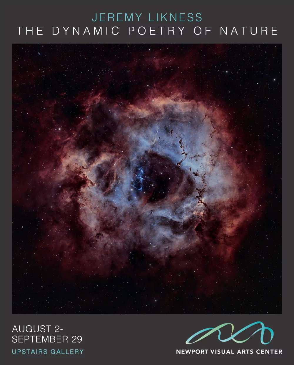
I now have far more flexibility to customize the site and add new features. For now, I’m going to step back to focus on preparations for my upcoming Astrophotography exhibition and the local “introduction to astrophotography” class I’ll be teaching in September. I hope that you find the new design performs well, is aesthetically pleasing and intuitive to use. If not, I take all feedback seriously and will do what I can to “fix the glitch.”

A few notes about the new site:
- Search is dramatically improved. Search for Jupiter, Milky way or Index Washington to see for yourself.
- The gallery allows you to bookmark your searches so it’s easy to recall or share them. For example, when I searched for all of my Rosette nebula images, and asked to see them in chronological order, I was able to save this Rosette search.
- The gallery links directly to the slideshow. For example, if you search for comets then tap the “slideshow” button, you’ll see the results of your search.
- Check out the new simplified gallery mode - here is an example that includes all of my Svbony images.
Thanks for visiting and I hope the new site serves you well.
I wish you all clear skies! As my friend and former professional astronomer Sifan likes to say, carpe nocturnum!
Post categories: Related tags: